The Art of Intuitive Card Payment Terminals
Looking at Card Terminals from User Experience Perspective
I am a fan of card payment terminals – the devices in shops and restaurants through which we pay with cards. They are a good example of how digitalization changes how we interact with services. The wallet-digging exercise has been turned into a card swipe. Instead of exchanging cash, we can nowadays use card terminals to swap numbers on bank accounts. This shift has introduced new human-to-technology interactions that card terminal designs must account for.
Sweden is a unique example as in most stores and restaurants purchases can only be made using digital payment methods – bank cards, phones etc. Cash is almost obsolete. Card terminals have become an integral part of people’s daily lives, which means they have to be intuitive and easy to use.
That is quite a design challenge – a challenge that I will dissect below from a user experience perspective. From spotting usability flaws to ensuring intuitive and inclusive design.
Contactless Confusion
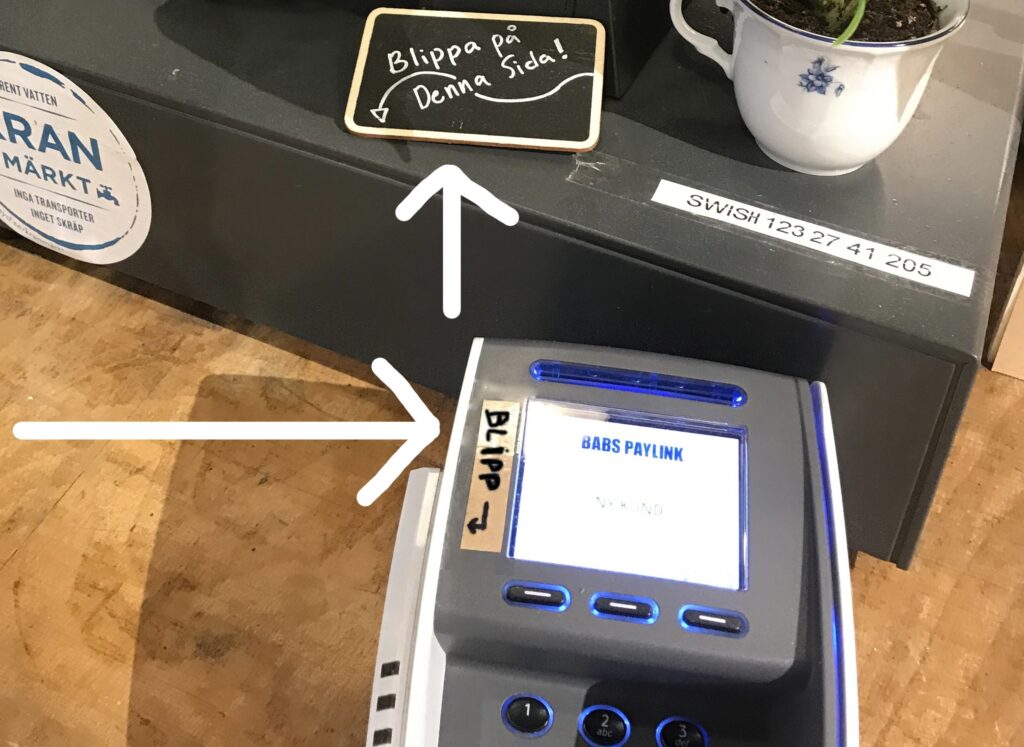
If you have ever fiddled with finding the contactless payment spot when paying, you should know that it’s not you – it’s the design! Many of the card terminal designs do not follow good design principles for guiding users’ actions. Plus the variety of card terminals out there makes it nearly impossible to know how to operate each and every one. Therefore, following design paradigms when developing a product comes in handy for ensuring an intuitive experience with digital devices.
Have you ever spotted those DIY signs on card terminals, showing you where to tap for contactless payment? This is a solution born out of the usability flaws in the terminal designs that fail to guide people’s actions. This phenomenon raises a crucial question: How do these design hiccups sneak into the product development process, especially when good usability is important for the product’s success?
The Craft of Creating Products
Behind every card terminal, is a team of engineers, developers, various disciplines of designers, product owners and others that determine the functionality and design of the product. Each discipline adds their unique expertise to the product. Designers especially try to ensure that the product is designed to be usable for everyone. The design needs to guide the new human-to-technology behaviors such as contactless payments.
Understandably, during the product design process, complicated decisions must be made — technical constraints may limit the location of the NFC or RFID area, the cables have to connect in a certain way, and so forth. Ultimately, these choices can shift the focus away from the usability factor. This is where UX design and research should come in. UX design principles and user research enable us to bring back the focus to usability.
Early Testing for Intuitive Products
The goal of user experience design and research is to make digital or physical products intuitive and accessible. UX designers carry out user research and usability tests to ensure the design choices make sense from the perspective of a test group.
Designs must be put in front of users early in the process to notice usability flaws before locking down the design. These “tap here” DIY signs mentioned above are essentially a band-aid for designs that have usability issues that could have been discovered in the user research process.
Exposing the Usability of Card Terminals
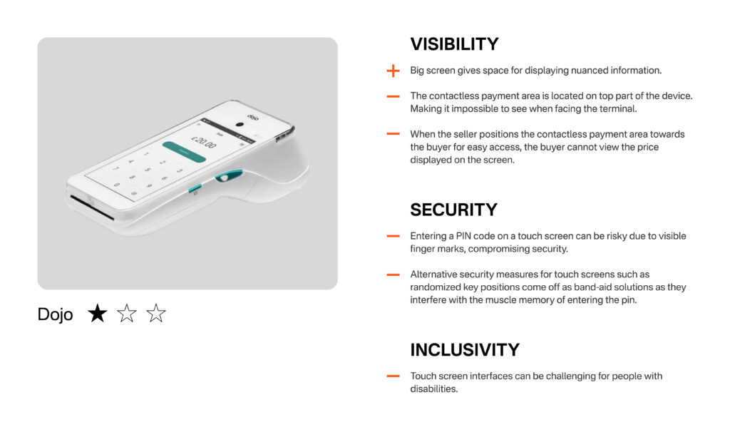
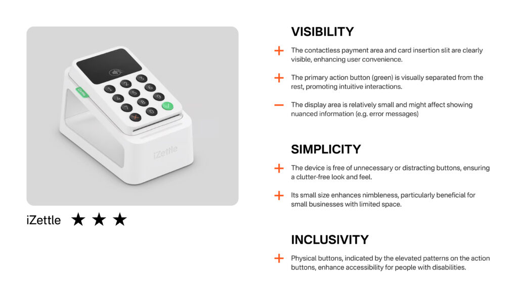
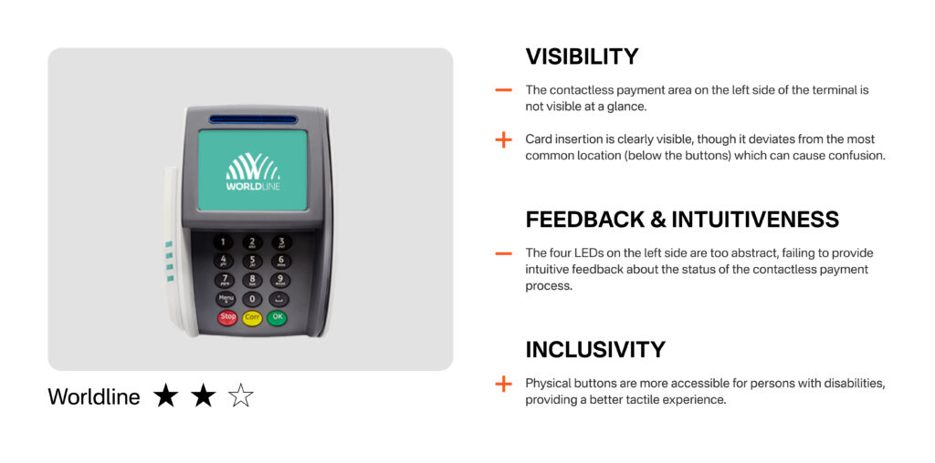
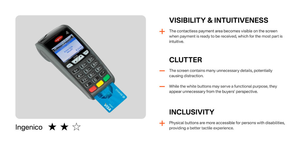
Over the course of living in Malmö, Sweden I have seen the good and the bad of card terminals. I gathered a few of the most frequently seen ones to conduct a small comparative analysis to illustrate some of the key components that make or break “good usability”.
High-level UX Assessment of Selected Card Terminals
What Constitutes a Good User Experience?
To provide further context, here are four important user experience values (heuristics) relevant to card terminals.
Visibility
You can minimize the user’s memory load by making elements, actions and options clearly visible (and tangible).
Simplicity & Minimized Clutter
Products should only contain information or features that are relevant. Every extra unit competes with the relevant units and diminishes their relative visibility.
Intuitiveness
Users will transfer expectations they have built around one familiar product to another that appears similar. Completely new interaction paradigms should be avoided.
Feedback
The design should always keep users informed about what is happening through appropriate feedback within a reasonable amount of time.
The Joys of User-Friendly Card Terminals
The main functionality of card terminals is important, yet for a product to truly thrive and stand out, it needs a user-friendly design with pleasant interactions. When card terminals offer intuitive experiences, they contribute to smoother transactions, benefitting both sellers and buyers. The buyers don’t need to dance around the terminal, searching for the elusive tappable area. Sellers are relieved, as they are no longer burdened with the task of repeatedly guiding customers through the payment process.