Setup
We started off with planning the testing sessions around three main pillars that covered the areas we wanted to look closer on. These pillars were aesthetics, ergonomics and contextual behaviors.
We ended up doing a total of 18 testing sessions with people who come from different countries, cultures, genders, age groups and who have varying technical knowledge.
Aesthetics
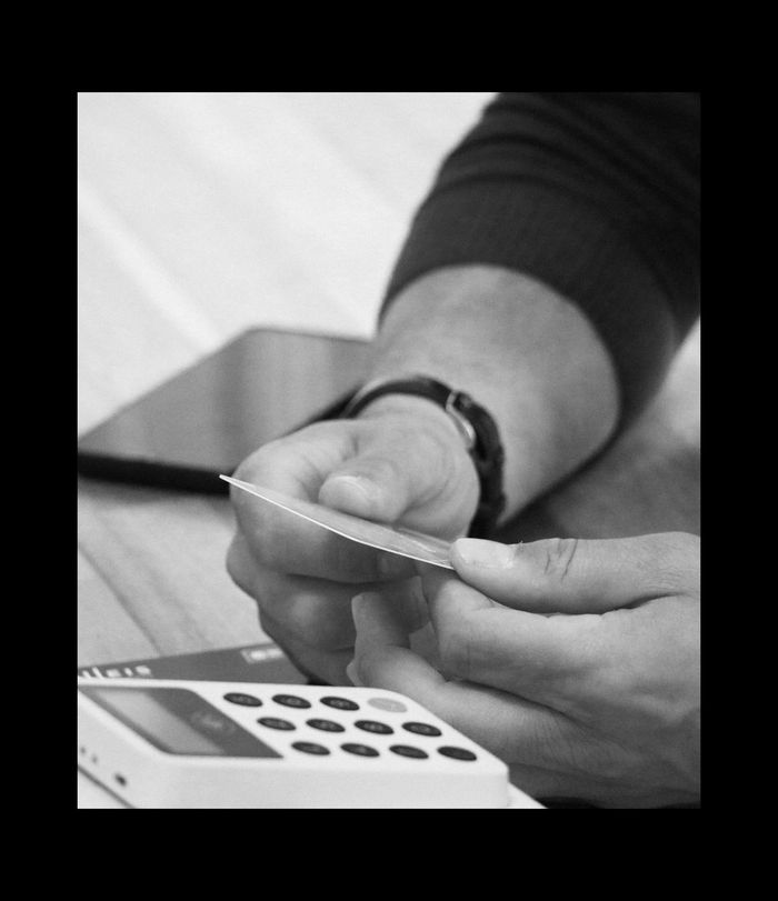
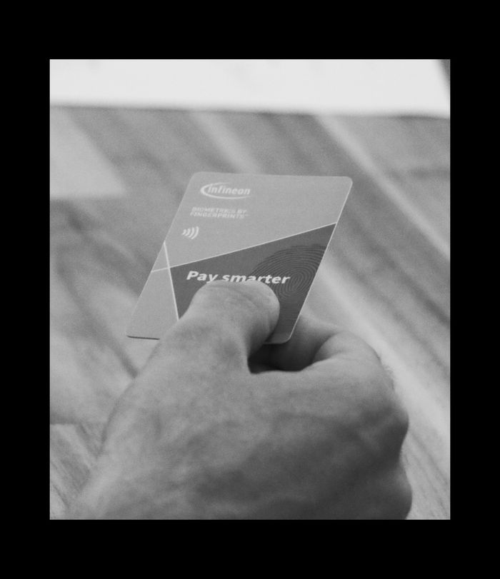
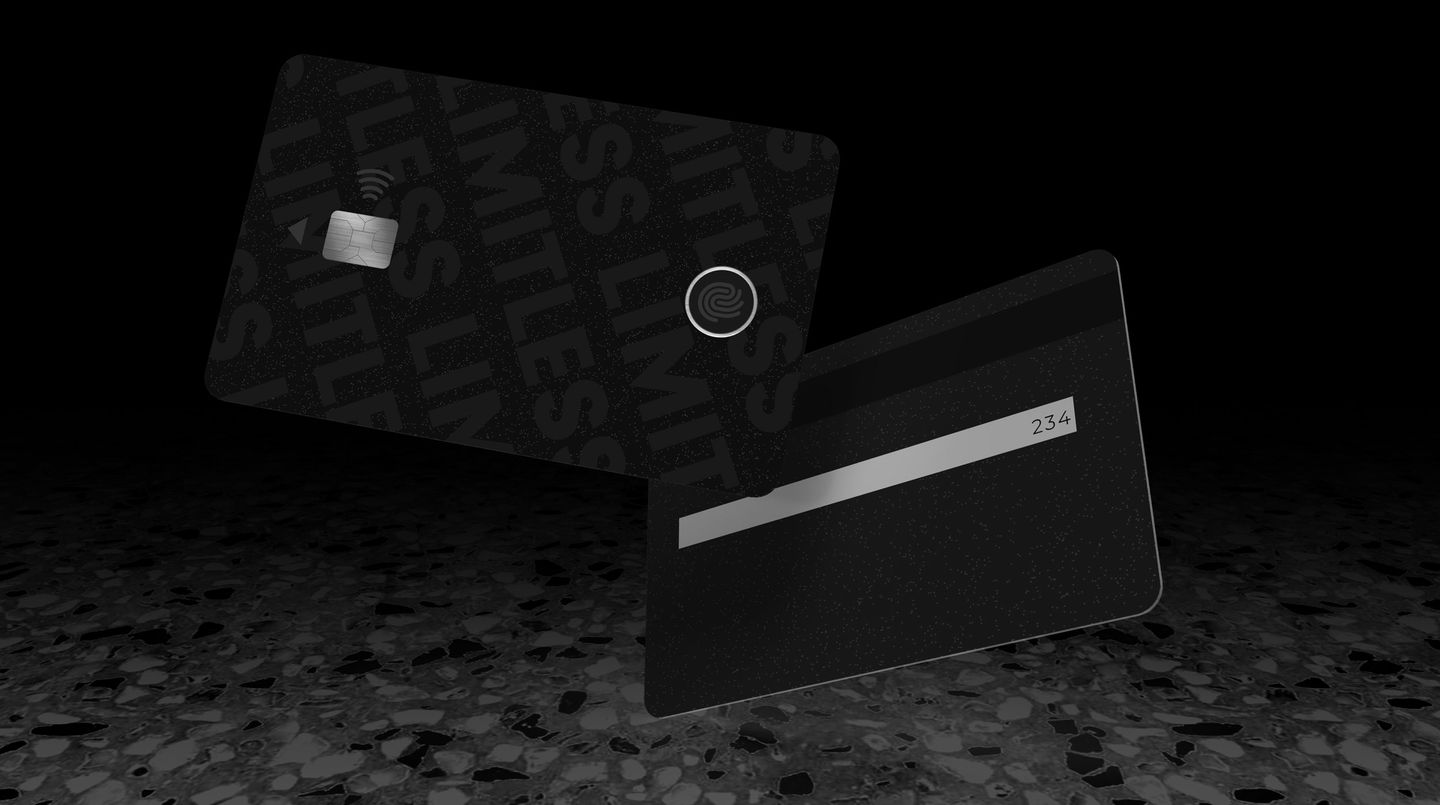
At this stage, we wanted to trigger and categorize testers' reactions to the colors of the card and the module, its layout, the wording employed, the different textures under the fingers, as well as the shape, placement and sizes of all elements.
Ergonomics
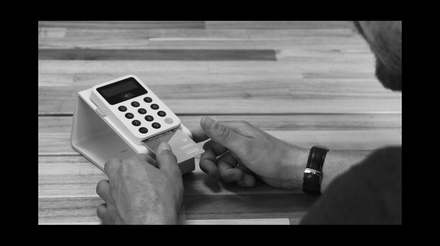
Then, the same visual and haptic elements were analyzed through the lens of affordances (implied actions to take) and signifiers (signs indicating where the action should be taken): were the testers able to identify specific actions they can take, and the way to perform them correctly solely by looking at the card and touching it?
Contextual Behavior
At the deeper level lies the “mental model” of the users, which translates to their understanding of the relationship between each component and their potential. With “mental models” identified, we were able to predict the user's behavior in the future and act accordingly. At this layer, we tested more fleshed out scenarios, and made a distinction between the first use scenario (on-boarding), and daily usage that can vary depending on the terminal placement, shape, size, and other external factors.

The Testing
Each testing session was divided into 5 parts. The first one entailed gathering general and contextual information from the participant, the second part focused around the aesthetical consideration of the card through an interview and a rating exercise, the third part contained a usability test structured around the ergonomic perception of the card, the fourth part involved a second interview with belonging exercises around the usage of the card. The fifth, and final part of each session, entailed a debriefing that covered general opinions and thoughts of the participant.
We tailored each part of the testing session in order to gather input on the card in a layered way, from the most brief perception to the deeper understanding of behaviors.
Recommendations & Concepts
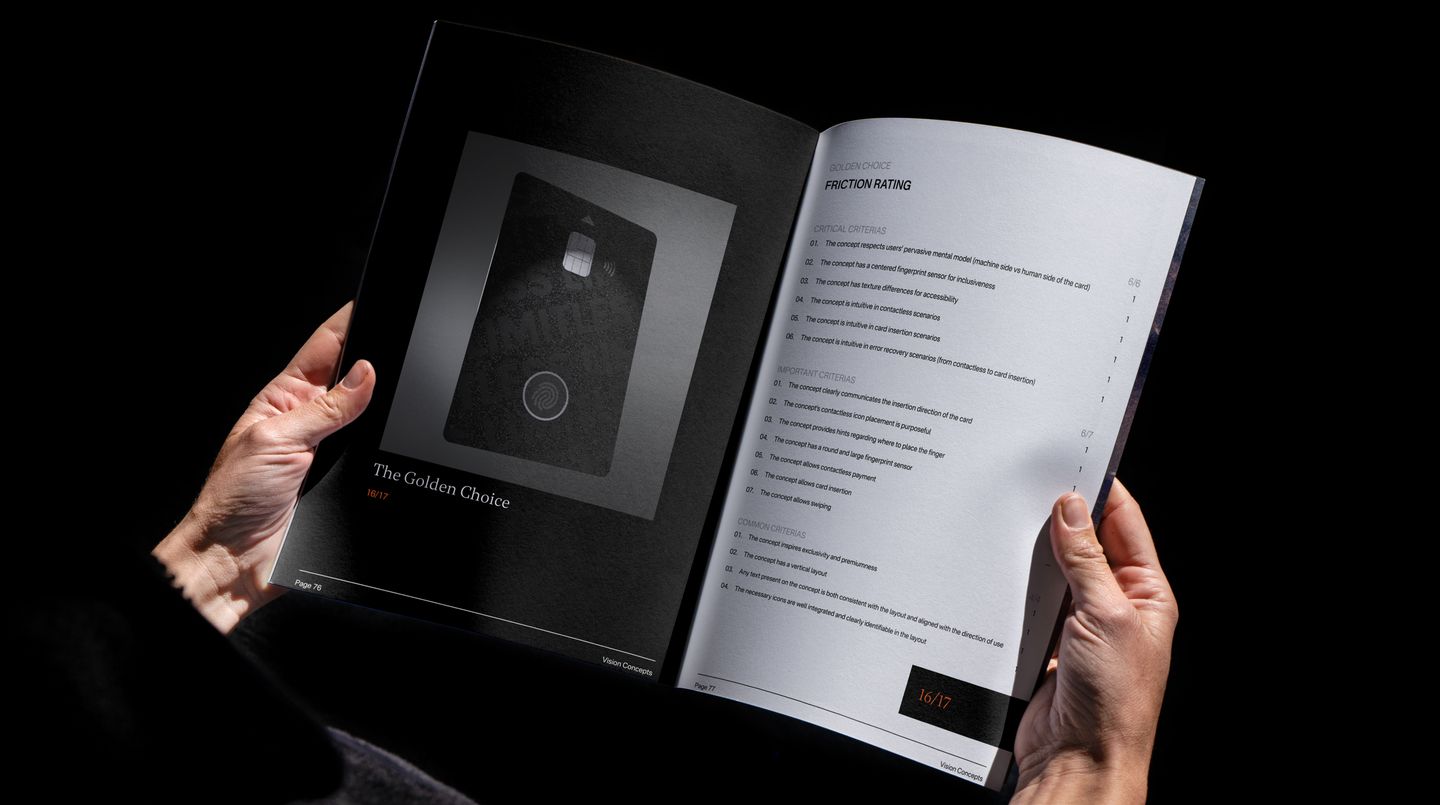
Based on the insights we gathered through the testing we formulated recommendations. With these recommendations we then created four different concepts. In order to aid the evaluation of these concepts, we formulated 17 criteria to rate the friction of each one. A high score meant less friction for the user - meaning a higher change of the concept being adopted.
Out of the four concepts we created, one of them scored the highest - we chose to name it “the golden choice”. This concept earned a score of 16/17 - thus ticking almost every single criteria. The design behind this concept was derived and backed up by the research done prior.
Outcomes
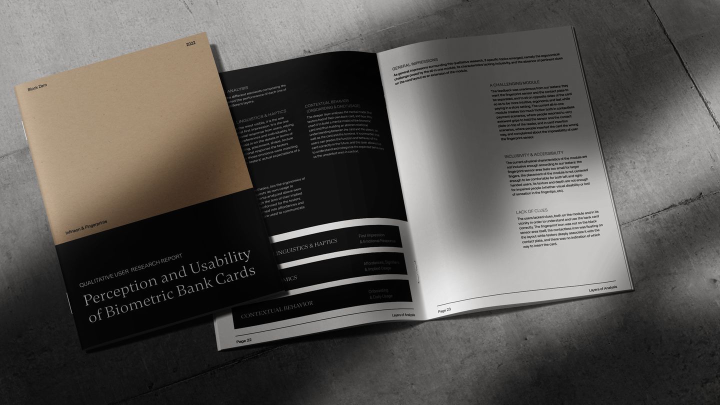
The outcome of this project was a comprehensive UX research report. Along with a detailed description of each cognitive and behavioral interaction pattern that emerged in the study, we provided clear and actionable suggestions on how to improve each of the specific topics brought up by testers, from small changes to wider and more complex modifications.