Logo
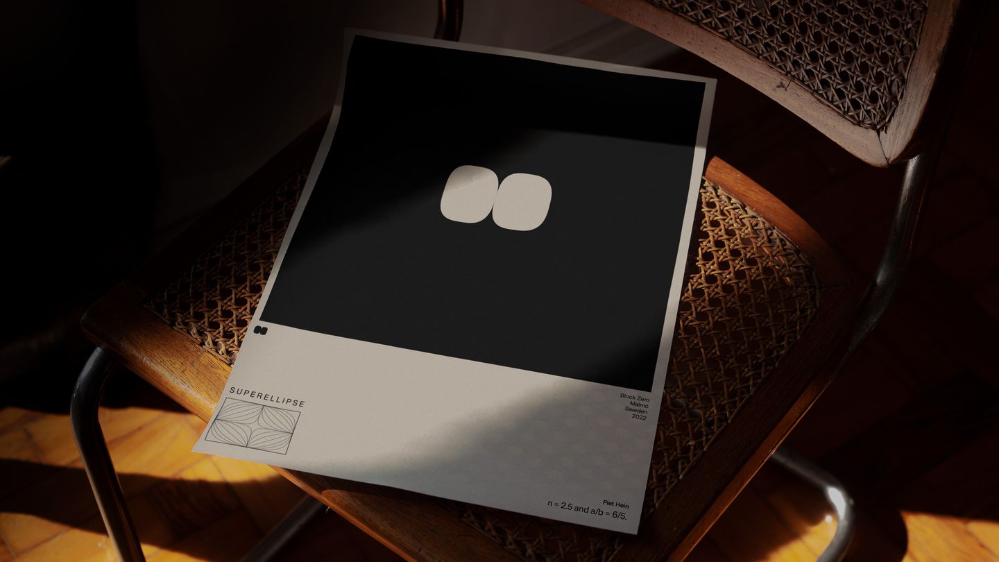
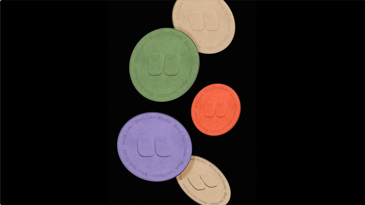
The Block Zero logo is made up of a combined logotype and logomark. The mark originates from the "superellipse" shape – named and made popular by the Danish artist and mathematician Piet Hein (1905-1996).
The now famous design became widely known in 1959 when Hein won a design competition announced by the city planning office in Stockholm, Sweden. Piet Hein's winning proposal was based on a superellipse with n = 2.5 and a/b = 6/5.
For us the superellipse represents the magic that emerges when science meets arts. As a group of people passionate about technology and design, we think it beautifully represents Block Zero as a company.
Colors
Block Zero's new color palette pays homage to our heritage, the purple and bright red, while looking forward and bringing in more earthy tones.
Typography
We chose Gambetta and Nacelle as Block Zero's primary typefaces. Gambetta is contemporary and mature, rigorous and refined, simple yet complex all at once.
Nacelle is our workhorse of choice. It's a neo-grotesque sans serif that has high legibility with metrics and details adjusted to create natural flowing shapes. We love them both.
Supporting elements
Our logomark, the superellipse, represents the process of form and function coming together. To further support this idea, we developed a generative design system based on the superellipse.
Brand Application
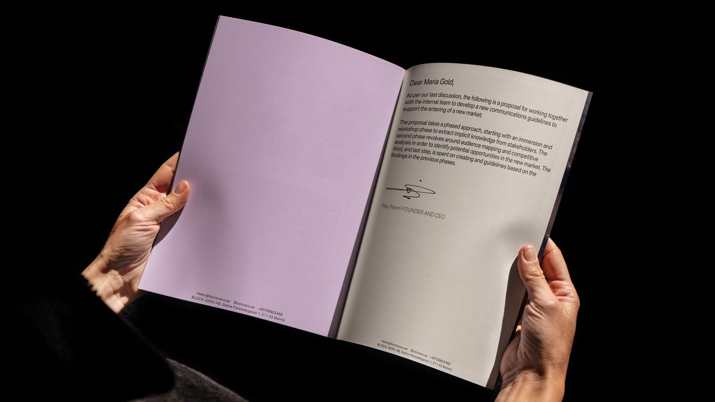
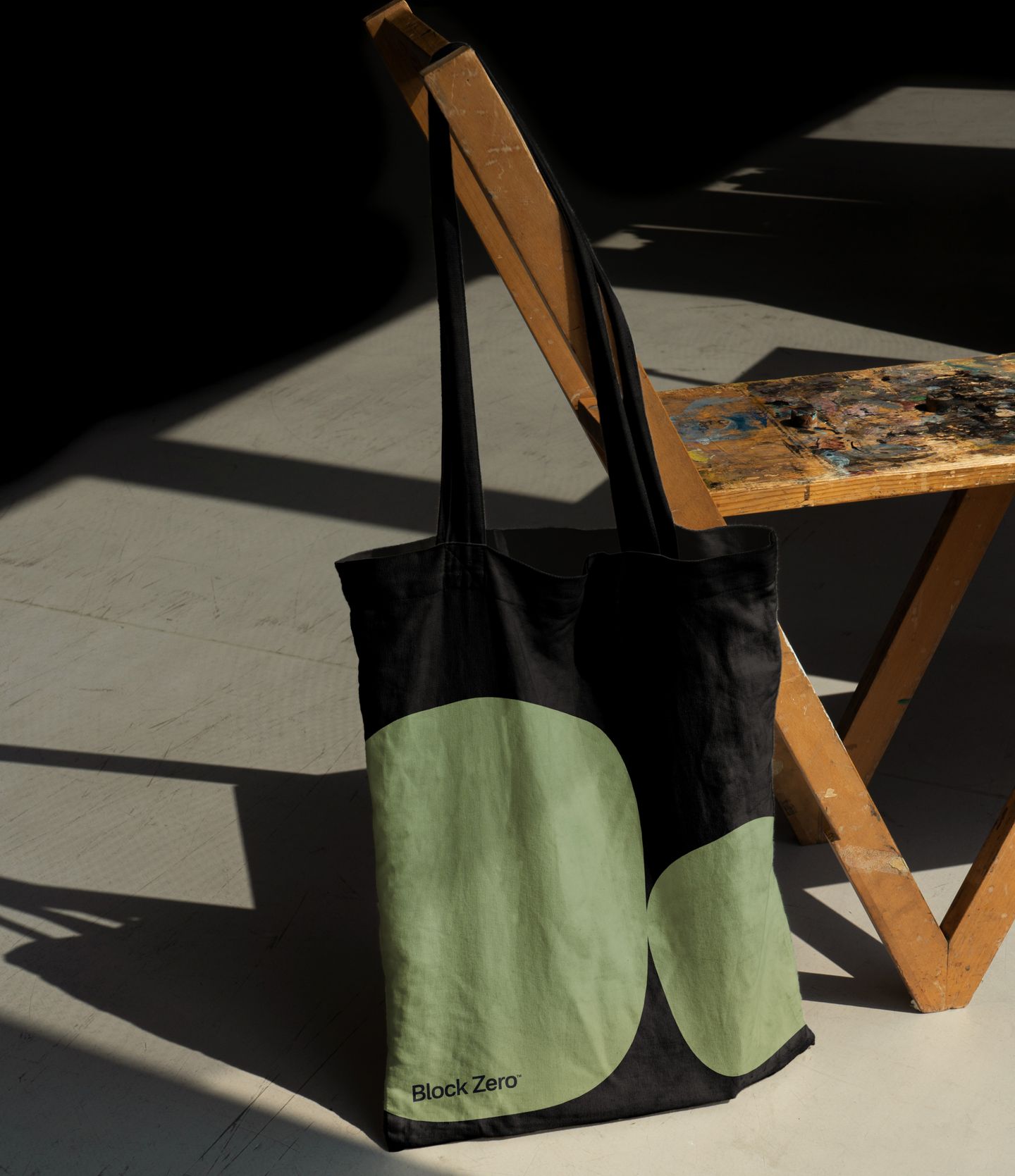
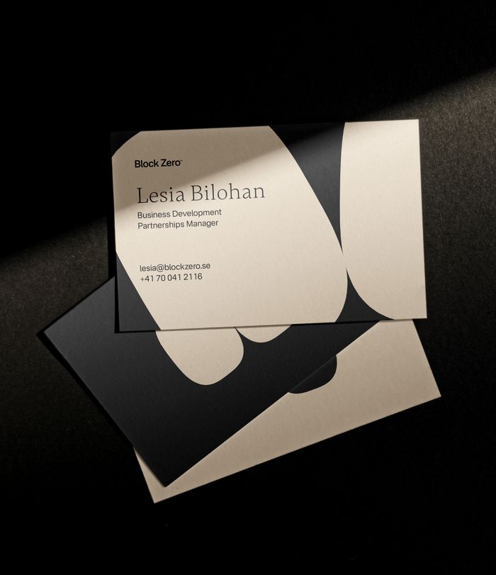
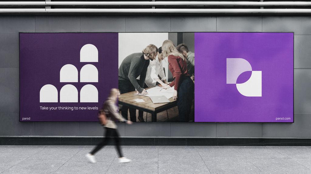
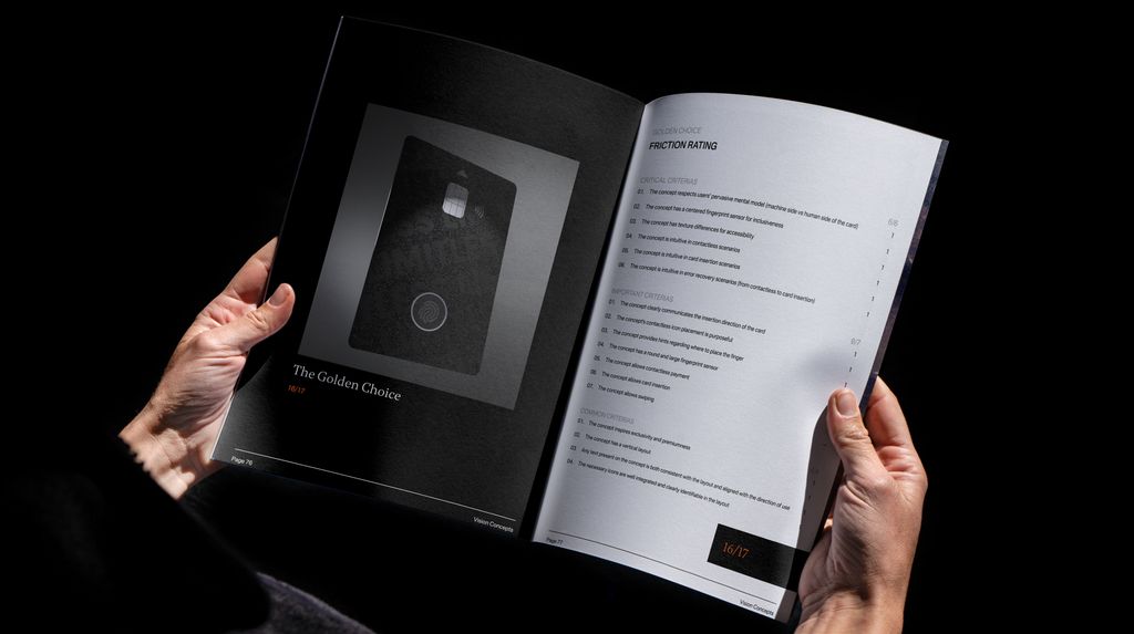
The Block Zero brand lives in a variety of contexts. We have a wealth of diverse perspectives and voices. Our brand gives room to play and express with visual consistency across all our channels.
